
Wendy's
STRATEGY.
IDENTITY.
RETAIL DESIGN.
GRAPHIC DESIGN.
PACKAGING.
EXTREME MAKEOVER
How do you evolve a well-loved and time-tested brand and make it relevant to today’s consumers?
WENDY’S STOCK PRICE LIFT
525%
IN 9 YEARS.
(LENGTH OF TESSER RELATIONSHIP)
110%
“FOR THE 2012 IMAGE ACTIVATION RESTAURANTS…THE DINING ROOM SALES ARE UP CLOSE TO 110%, CARRYOUT SALES UP IN AREA OF 55% AND PICKUP WINDOW UP 15%.”
EMIL BROLICK, NRN
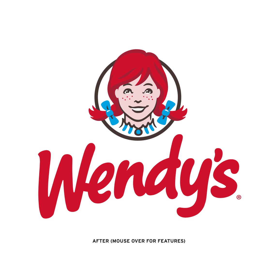
EVOLVING AN AMERICAN ICON: IDENTITY MAKEOVER
When tackling the evolution of a well-loved and time-tested icon, Tesser knew it was critical to respect the existing equities, while signaling meaningful change. Her age, her hair and her clothing all needed to signal authenticity while being relevant to the next generation of square hamburger lovers. The result is a grown-up image, as beautiful as ever.
JOSHUA JOHNSON.
DESIGN SHACK
“{orange} The new logo is an excellent update.”
CREATING A BEACON: STORE DESIGN PHASE
Tesser created four distinct restaurant prototypes from a common design strategy: UltraModern, Contemporary, Urban, and Traditional. Wendy’s decided to implement all four prototypes in regions across the country to measure customer response and evaluate the practicality, functionality and operational efficiency of the designs.
The UltraModern design was deemed the best to reflect the “Real” Wendy’s, which became known as the Image Activation prototype. The store’s unique features include a dynamic modernist design, innovative customer flow, a fireplace, café-style booths and free wifi — meeting the everyday cravings and comforts of the modern consumer.
CHRIS NICHOLS.
YAHOO FINANCE
2013
“Restaurant Stock of the Year”
DAVID KARAM.
FORMER PRESIDENT OF
NORTH AMERICA WENDY’S
“{orange} The new restaurant design is outstanding. It impacts the entire customer experience and updates Wendy’s image while maintaining our focus on quality.”
KEEPING THE MOMENTUM: GLOBAL IMAGE ACTIVATION
For Wendy’s, the Image Activation was more than a remodel. It was a long-term initiative. So long-term, that Wendy’s and its franchisees implemented Tesser’s work across 521 North America system restaurants and built 99 new North America restaurants and 50 new International restaurants in 2016. At the end of 2016, approximately 32% of the global system features the new, “Real” Wendy’s image.
TODD PENEGOR.
CEO & PRESIDENT,
THE WENDY’S COMPANY
PRNEWSWIRE
“We have now recorded 16 consecutive quarters of positive same-restaurant sales and total new restaurant openings have accelerated in both North America and International with nearly 150 new restaurants opened globally in 2016. As a result of our brand transformation efforts and with the support from our franchise partners, the Wendy’s system has never been stronger.”


