
Popeyes Louisiana Kitchen
STRATEGY.
RETAIL DESIGN.
GRAPHIC DESIGN.
SPICE UP SALES
Popeyes Louisiana Kitchen, the second-largest quick-service chicken restaurant group, offers food made from scratch, however their existing store design was not resonating that message with customers.
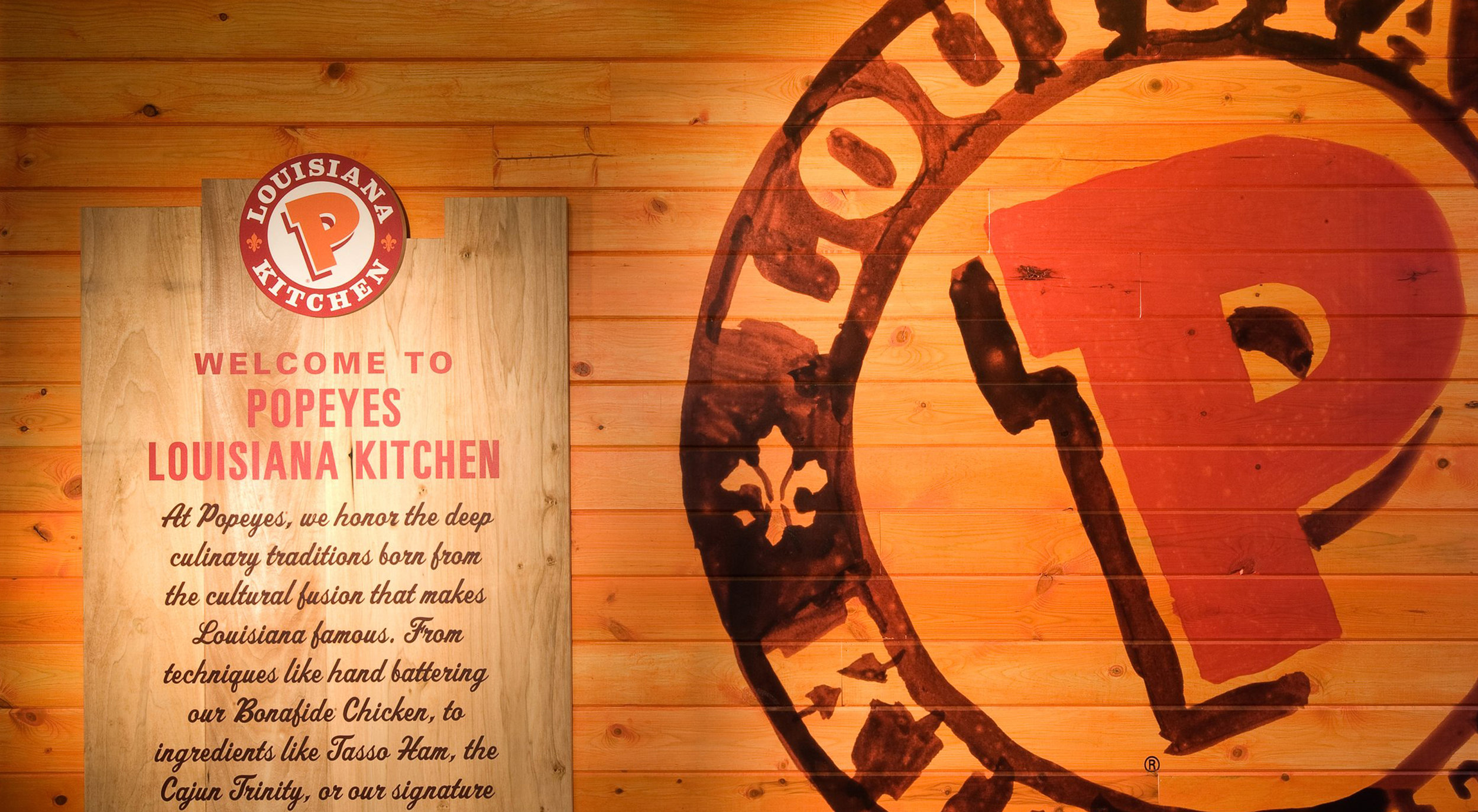
Tesser was brought on board to spice up the Popeyes store design, aligning it to their brand values, retaining their heritage and their food made from scratch ideals. Tesser created a high-impact design based on Popeyes’ authentic Louisiana culinary roots and their rich and varied menu. Tesser created an entirely new dining experience featuring dynamic branding elements, eclectic materials, hand-drawn messages and a feature wall of authentic Cajun spices. The store is now as welcoming as any Louisiana kitchen!
STOCK PRICE LIFT OF
503%
IN JUST 4 YEARS
90%
OF STORES REMODELED WITH TESSER'S DESIGN
CHERYL BACHEDLER.
CEO POPEYES
“{orange} Design that makes the food taste better.”
LOUISIANA GOES GLOBAL
For Popeyes’ international expansion into Asia and South America, Tesser developed a freestanding design to be a beacon for the brand. The eclectic style of the building is a modern take on authentic, rural Louisiana architecture. The interior’s vibrant colors and tone of voice are inspired by Louisiana Zydeco music. The artpack messaging is modified to resonate on a global level. It celebrates the joy of food and music and their ability to bring together a community.


